
This is an alternative book cover for Ernest Hemingway's The Old Man and The Sea. I created a stencil from a primary photograph, and printed vivid pink acrylic onto a light blue background.

This is a mono print from the start of a repeat pattern project, with the theme Birds and Feathers. I began experimenting with different positions of the birds before moving on to trying out colours and patterns.

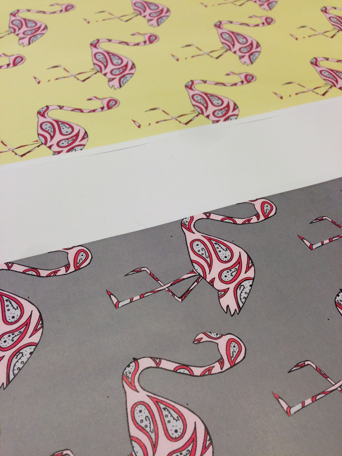
After experimenting with printing, I began playing around with different patterns. The paisley pattern was my favourite, so I scanned in my idea and recreated it on Photoshop for my final design.
These are my final outcomes for the half drop repeat pattern.

For my final major project, I chose a variety of bars, venues and restaurants around Norwich and created an illustrated map. These are my primary photos, which I took with a disposable camera.

From my photos, I created illustrations using fine line pen. These are also the illustrations I used for my final map.

My original map idea was to use a combination of photography and illustration. After discovering photographer/artist Ben Heine, I found an effective way of achieving this. Although I didn't end up using it in my final piece, I am really pleased with how it turned out and would like to try this technique again.

Before creating my final piece, I wanted to experiment pairing my illustrations with different medias. Although Photoshop was quite simple, I really liked the effect of the flat colour, as it had an almost cartoon look to it.

This is my final map from my final major project. I decided I wanted to use a simple colour palette, but incorporated it into the background rather than the illustrations. I tested out a variety of colours within my illustrations but they weren't clear when scaled down, so left them as black and white.

The beginning of my second year involved a lot of observational drawings. This was created using a permanent marker and a fine liner, as I was practising with different pen thickness.

I decided I wanted to make my observational drawings into illustrations. This was originally a black pen drawing, but I also created a red and a blue one using Photoshop. I printed them both on tracing paper and layered them to create a blurred effect.

This piece is from my most recent project; The Cambridge Project, in which I advertised the Fitzwilliam Museum. I wanted to move away from black fine line, so created a sketch using red Biro which I think really enhances the shadows.

Alongside my previous museum sketch, I tested out other colour combinations and styles.

I decided to create a series of posters to advertise the museum. I wanted to use photography and typography on one and illustration on the others. Here I have experimented with different photographic effects and filters.

After using sponge to stencil a typeface, I realised that I liked the effect of a non-solid font, so decided to use half-tone. Brighter vivid colours looked best against the black and white background, so I opted for a yellow/pink layer.

My alternative poster uses the red Biro illustration. After layering typography, I decided to try layering an image. I really liked the effect, especially when using a limited colour palette.

For my current project, I am redesigning the front cover of Tate Etc. magazine to advertise their Making Traces exhibition. I want to create my own typeface that relates to the messy abstract work and use it as the title font. I took the term Traces literally and used tracing paper to create an artistic typeface.

Alongside graphic design, I am a keen photographer. I am currently interested in glow photos and these are four of my best ones. I really love how the colours blend into one another and would be interested in creating some from of art from my photos.